
Designed by UONG JOWO, PlanMag is a Magazine Blogger Template that lets you write articles and blog posts with ease.
Create a great news blog with PlanMag template. Theme is perfect for blogging and excellent for a news, magazine, publishing or review site.
PlanMag is simple, and easy to use for a fashion, food, lifestyle, vlog, personal, travel, viral and more.
DEMO
Download
PlanMag Responsive Magazine Blogger Template
- Uong Jowo
- March 19, 2020
- Themes ThemesDesigned

Designed by UONG JOWO. Tubermag is Video blog from Youtube only. This template aims to help you display your video post content in the right way. The responsive theme allows users to embed videos and the homepage is easy to build with plenty of widgets. The theme includes automatic recent video post as slideshow.
This template does not need to edit in HTML except in the Layout
DEMO
WordPress Theme with Foundation CSS framework: http://iotheme.com | Feature: base on Underscores, Foundation CSS framework, mobile with offcanvas menu, dashicons -the official icon font from WordPress, custom theme name, text domain and more, update source from Underscores and Foundation everyday. Thanks for everything!
ioBlue responsive wordpress theme designed by iotheme.com, has been converted into a blogger template by Uong Jowo and added a new comment form.
DEMO
ioBlue
By ioTheme
Preview Download
Version: 1.0.8
Last updated: April 30, 2018

A blog or website background image not working on actual mobile devices.
Use css below
1. Left background image:
@media(max-width:480px){
body{
background-image: url("img.jpg");
background-repeat: no-repeat;
background-attachment: fixed;
background-position: top left;
background-size:350% auto;
}
}
2. Center background image:
@media(max-width:480px){
body{
background-image: url("img.jpg");
background-repeat: no-repeat;
background-attachment: fixed;
background-position: top center;
background-size:350% auto;
}
}
2. Right background image:
@media(max-width:480px){
body{
background-image: url("img.jpg");
background-repeat: no-repeat;
background-attachment: fixed;
background-position: top right;
background-size:350% auto;
}
}
Use css below
1. Left background image:
@media(max-width:480px){
body{
background-image: url("img.jpg");
background-repeat: no-repeat;
background-attachment: fixed;
background-position: top left;
background-size:350% auto;
}
}
 |
| Left background |
2. Center background image:
@media(max-width:480px){
body{
background-image: url("img.jpg");
background-repeat: no-repeat;
background-attachment: fixed;
background-position: top center;
background-size:350% auto;
}
}
 |
| Center background |
2. Right background image:
@media(max-width:480px){
body{
background-image: url("img.jpg");
background-repeat: no-repeat;
background-attachment: fixed;
background-position: top right;
background-size:350% auto;
}
}
 |
| Right background |
How to make background image fixed responsive working on actual mobile devices with simple css?
- Uong Jowo
- February 17, 2019
- Blog

Designed by Uong Jowo, Photosout is same like Blogsletter a responsive blog Template for those who want to showcase their creative work and build a strong experience with their users. From travelers to photographers, Photosout is the template choice to reach your blog style.
The Home Page via recent post areas. Let the users find your personality from the 1st page they visit.
The Single post via a parallax effect on containers that have background images and text above them.
DEMO
regard,


About Me
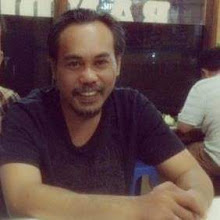
- Uong Jowo
- Uong Jowo was Born In Surabaya, March 1971. I'm A Blogger Templates Designer and a Converter Wp Themes to Blogger Template.